PTR Changelog 2018-12-06: new design
-
This post describes changes on the Public Test Realm.
In this update we'd like to introduce the results of what our frontend team (designer Roman and developer Dmitriy) has been doing during last two months. We have revamped the entire visual style of the game, and today we're starting to deploy it gradually to various parts of the game UI.
First of all, Screeps will have new logo soon!

It is much more visually clear, sends more obvious message of coding, and has "creeps" part highlighted and animated. Fun!
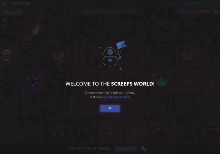
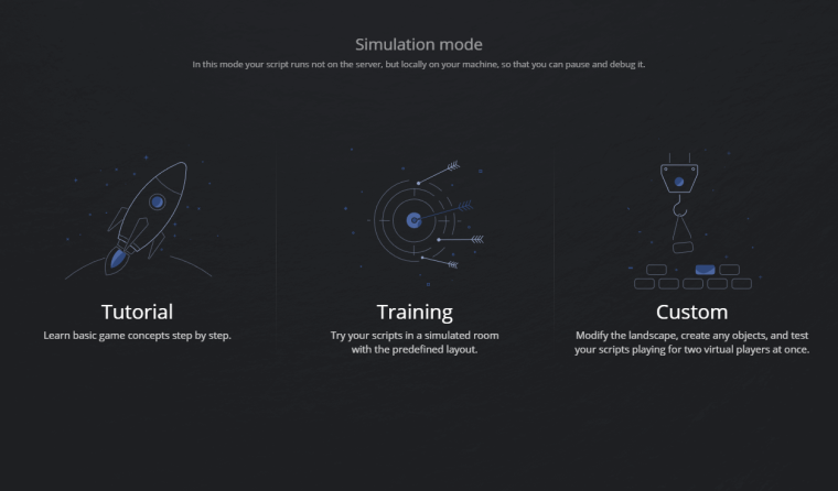
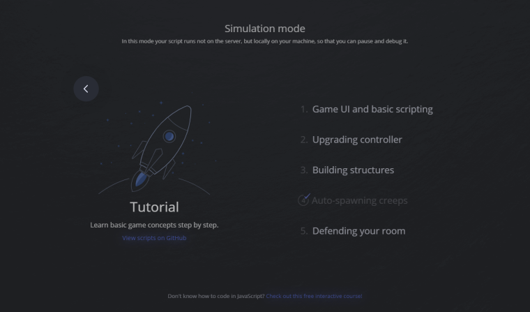
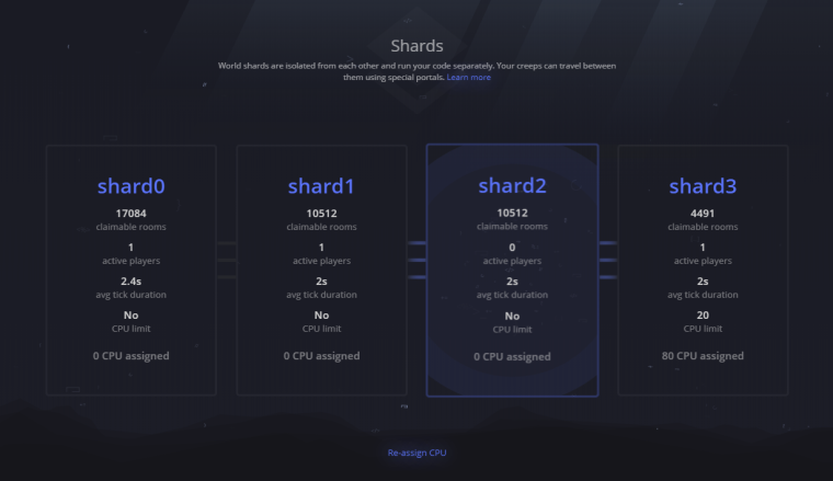
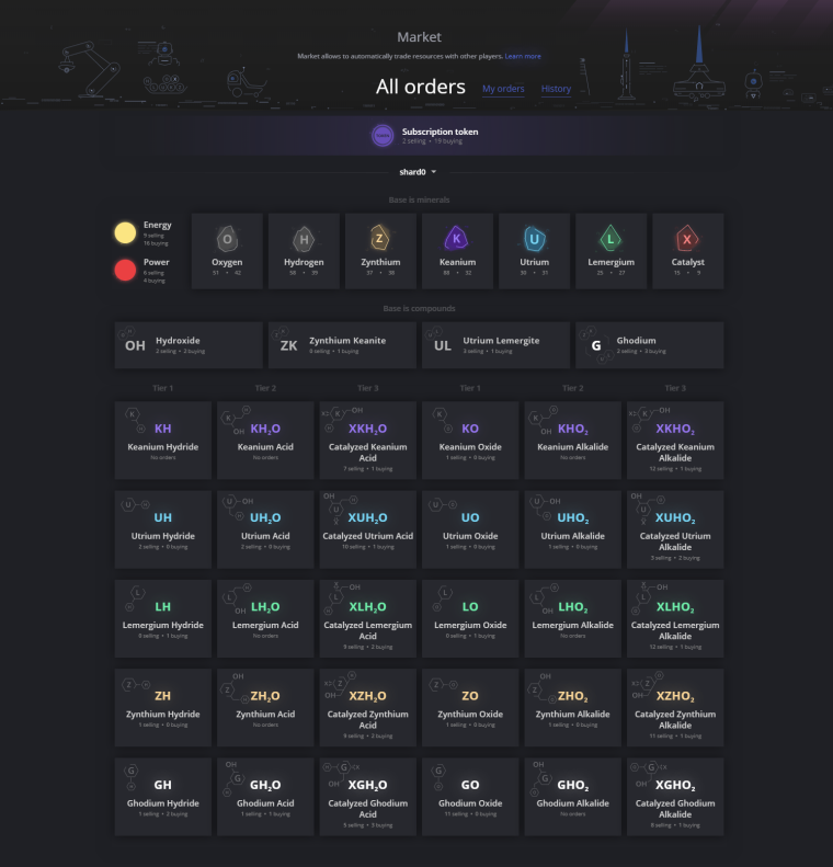
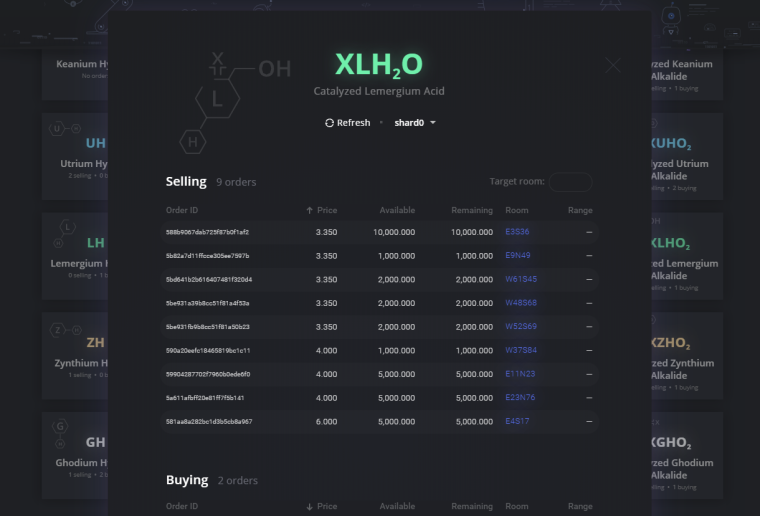
Some game screens have been redesigned. This is how they look in the game:
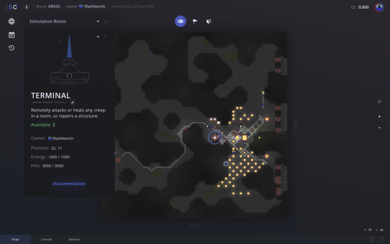
We're going to redesign almost all other game screens as well. For example, we're working on the main room UI as well (still work in progress):
A note for those interested in technologies behind the scene: we're migrating from AngularJS to modern Angular on these UIs.
Now to changes in functionality.
-
Subscription Tokens market is now global and works between shards. You can buy and sell tokens from/to any shard, all orders are visible on all shards.
-
Due to this,
createdproperty in the order is now meaningless for tokens (since it is in ticks), and newcreatedTimestampproperty has been added. -
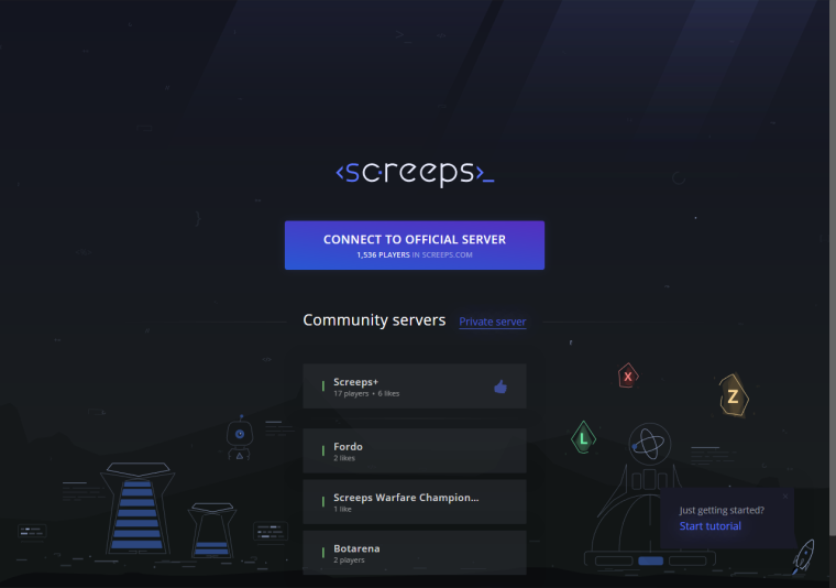
As it is shown on the first screenshot, the Steam login page now has option to choose one of the predefined Community servers to connect. If you want your server to be added to this list, please send a email to contact@screeps.com.
This client update is available on Steam using the
public-test-realmbeta branch in Steam game properties: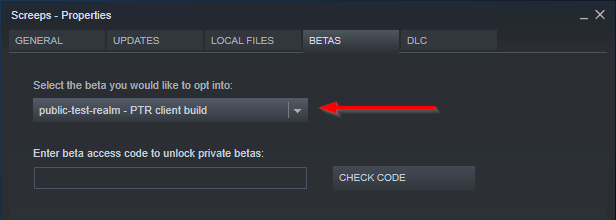
What do you think about this new design?


-
-
Really excited about this!
It looks really slick, and I like how the new logo's
cis a creep. Looking forward to the full release
-
Looks awesome! I really like redesign of the logo and market overview - heck, those molecular mineral icons look amazing!
Although it took me a few seconds to understand how the layout is supposed to work in the table at the bottom as reading from left to right it suddenly goes from T3 to T1 - maybe it would help if there was a small gap or line in between them, right in the middle, as a visual aid?
Edit: Looking at the WIP-ingame screenshot, this "line" could also be visualized by a Terminal shooting resources from the bottom of the page

-
@artch This looks awesome. Huge shoutout to your frontend team for their hard work. It's awesome to see the community servers also get more official recognition, I've always felt that its the community support and engagement that makes screeps so vibrant. I'm a little biased considering botarena, but still.
In particular, I really like the visual redesign of the compounds/minerals. It looks super sleek to have them actually like molecules.
Ps. Excited for the new terminal changes with remotely attacking/repairing units in the second to last screenshot.
 There are also a few grammatical errors in the copy text I can see, but obviously these are rough drafts.
-
That sure is very different from what the actual game looks like. The old design is more inline with the game's look, but I still like the overall feel of the new design a lot !
However I'm very confused by all the robotic little critters. What are these, are they supposed to be creeps? Why do they all look so different from each others ? I think I like it better when creeps were shapeless little roombas that could be possibly anything we want to see in them.
-
The new UI looks really nice. However, beware of using up space on pretty things when some pages are lacking important information. If you are redesigning the UI, I would like to take this opportunity to make some requests:
- Please could we have a single page that shows the combined price history for all minerals
- Similarly, it's all very well showing the number of buy/sell orders, but it would be much more useful to see the minimum selling and maximum buying prices.
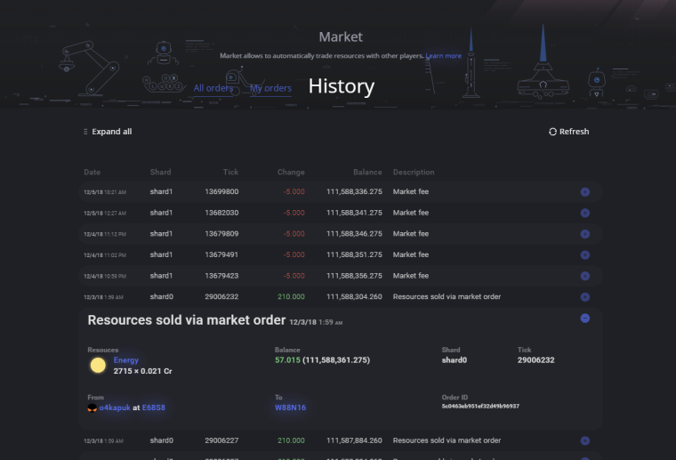
- Please could the market history page show the useful information without having to hover over the tooltip (or expand the row as in the screenshot above!!). At the very least this should clearly show the mineral type, price per unit, mineral amount, source and destination. Ideally also the total energy cost. Like this:

- Is there any chance of providing us a way to add information to the UI for specific objects? For example, if I click on a creep I want to see its role and current task.
But most importantly...
- Please, please could you avoid the popup menu when clicking on a square with multiple objects!
At the moment, if I click on a square with a creep and a road, I get a popup menu with "creep" and "road". If I click on a spawn with a rampart I get a popup menu with "spawn" and "rampart". This essentially means that I almost always have to click twice to see any information. This is really annoying! If I click on a square I expect to immediately see details about what is in that square. Unless I'm inspecting their health, roads and ramparts are irrelevant. Ideally the details panel should just immediately show a list of information about all objects in that square (roads and ramparts have very little information anyway), but alternatively you could auto-select the most important object and then let me expand or select unimportant objects if I want to see them.
Thanks.

-
@estecka said in PTR Changelog 2018-12-06: new design:
However I'm very confused by all the robotic little critters. What are these, are they supposed to be creeps? Why do they all look so different from each others ?
Yes these are creeps. They are different because of high configurability, there is no "standard" look of a creep.
-
@systemparadox said in PTR Changelog 2018-12-06: new design:
Please could we have a single page that shows the combined price history for all minerals
I'm not sure I'm getting what do you mean.
Similarly, it's all very well showing the number of buy/sell orders, but it would be much more useful to see the minimum selling and maximum buying prices.
This might be not relevant if the list contains the highest/lowest order with marginal price and very low amount. Also, is there really a case of checking prices of multiple resources on the same page?
Please could the market history page show the useful information without having to hover over the tooltip (or expand the row as in the screenshot above!!). At the very least this should clearly show the mineral type, price per unit, mineral amount, source and destination. Ideally also the total energy cost. Like this:
Have you tried the "Expand all" link in the new UI?
Is there any chance of providing us a way to add information to the UI for specific objects? For example, if I click on a creep I want to see its role and current task.
I admit this would be cool, but this feature request is really huge and would take a lot of development efforts.
Please, please could you avoid the popup menu when clicking on a square with multiple objects!
Let's imagine we automatically select all objects at the square. What should happen if you clicked at the square with a creep, a container, and a road, and the creep moved to another square on the next tick?
Anyway, we'll start redesigning the room UI only after Power Creeps and some other new screens and features, it's not top priority right now.
-
@artch said in PTR Changelog 2018-12-06: new design:
@systemparadox said in PTR Changelog 2018-12-06: new design:
Please could we have a single page that shows the combined price history for all minerals
I'm not sure I'm getting what do you mean.
At the moment there is a "price history" table at the bottom of the market page for each mineral that shows (date, transactions, total volume, price avg/stddev). It's really hard to compare the prices of different minerals. There's no API for this information either.
This might be not relevant if the list contains the highest/lowest order with marginal price and very low amount. Also, is there really a case of checking prices of multiple resources on the same page?
Yes. When choosing which room to expand to, knowing which minerals are in demand is very important.
Please could the market history page show the useful information without having to hover over the tooltip (or expand the row as in the screenshot above!!). At the very least this should clearly show the mineral type, price per unit, mineral amount, source and destination. Ideally also the total energy cost. Like this:
Have you tried the "Expand all" link in the new UI?
Ugh. It just takes up so much space! I've got a massive screen and I can still only see 4 rows! Just squash it down and put everything on the row without any expanding. If there was actually more detailed information then expanding would be useful, but there's nothing in the expanded section that shouldn't just be on the row in the first place.
Is there any chance of providing us a way to add information to the UI for specific objects? For example, if I click on a creep I want to see its role and current task.
I admit this would be cool, but this feature request is really huge and would take a lot of development efforts.
I know I was being hopeful

Let's imagine we automatically select all objects at the square. What should happen if you clicked at the square with a creep, a container, and a road, and the creep moved to another square on the next tick?
Oh. I hadn't thought of that.
-
The parallax background in the header that moves with the mouse cursor is pretty, but really annoying. Please just make it static.
-
I also got a conflict of interest with the new minerals. They look rad as hell, but they're going to be a nightmare to reproduce with RoomVisuals,.. x)
-
@artch are there any plans to allow a visual option of viewing alliances? I know that yall have used LoAN in world reviews and everything before, so although it's community-based and developed, it is in a "semi-official" status. it would be nice to get some of that information shown without client-abuse or tampermonkey scripts. I also think that this would be a good opportunity to add in the tampermonkey that migrates a live room into sim. Are these possibilities at all? I've currently got 2 tampermonkey scripts applied to screeps.com: LoAN and "migrate room to simulator". Both would be great additions to the client without hacks...
Edit: alternatively, is there any intent to make it easier for the community to dev tampermonkey scripts to add in features you arent interested in doing yourselves?
-
@semperrabbit No such plans on the horizon currently.
-
ok, next question. is there any intent to make the new client more mobile friendly? scroll the map with finger swipes, etc?
-
@semperrabbit are your scripts available publicly anywhere? I would really love the migrate room to simulator script!
-
@SystemParadox It's definitely not mine, it was a collab of @Dissi and @Esryok back in the day. but yes, by all means, here it is... https://github.com/Esryok/screeps-browser-ext/raw/master/migrate-screeps-room.user.js
It provides a right-click context menu with a migration option. it takes literally everything in the room, terrain, structures, creeps, and moves them into a custom sim room.
-
@semperrabbit thanks very much! That is so awesome!

-
I have mixed feelings about that, the new style definitely has improvements...
But honestly it looks a bit generic, and very similar to what is valve doing.It feels a bit cold, where the old theme feels hm how should I put it, nostalgic and friendly.
Could I ask for a favor? Try the new design with the old color scheme.Oh and I like the parallax but it shouldn't be in functional panels, the start screen is enough.
(The additional server list is a awesome idea)
-
@semperrabbit Yes this is planned.

-
It certainly looks sharper! One suggestion... On the market screen with all the compounds, a line that says what that compound DOES would be helpful... like "Melee Attack", "Harvest", etc. You'd think I'd have that memorized by now... but I don't, I'm rarely sure if I need a XXXO2 or a XXX2O one. I have to look it up all the time.

-
@artch said in PTR Changelog 2018-12-06: new design:
They are different because of high configurability, there is no "standard" look of a creep.
Pretty sure most players agree that creeps would look like roombas in real life

