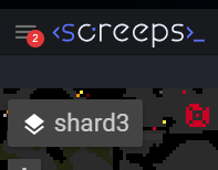
Small Suggestion that is an easy fix
-
Imagine somebody joining screeps, getting a message from another player and seeing the message icon in the upper left of their UI.

I suspect that simply because it is red predisposes the recipient with a danger/error/wrong/bad mindset before they even know who it is from or what it says.
I know full well that most people use slack chat as their main means of communication but I can't help but wonder if a simple color change would have a more positive psychological effect to say green or a neutral color blue.

-
I'm not so sure, red "counter" bubbles for notifications is pretty ubiquitous across the internet (Facebook, iOS, Slack, Youtube, etc). I figured people would be trained for it by now.